/home/kueuepay/public_html/public/backend/sass/components/_forms.scss
/*-------------------------------------------------
    [ ## Fields ]
*/
input[type="text"],
input[type="email"],
input[type="password"] {
    &:focus {
        outline: none;
    }
}
input,textarea{
    padding: 12px 20px;
    &::placeholder{
        color: $color--heading;
    }
}
textarea {
    display: block;
    width: 100%;
    display: block;
    min-height: 220px;
}
input,
select,
textarea {
    border: 1px solid $border--base;
    vertical-align: baseline;
    font-size: 100%;
    color: $color--heading;
}
label {
    font-size: 14px;
    font-weight: 500;
    margin-bottom: 10px;
    display: block;
}
/*-------------------------------------------------
    [ ## Forms ]
*/
select{
    outline: none;
    cursor: pointer;
}
option{
    color: $color--heading;
}
.input-group{
    margin-bottom: 0;
    flex-wrap: nowrap;
    input{
        border-radius: 5px 0 0 5px;
        height: 40px;
    }
    &.append{
        input{
            border-radius: 0 5px 5px 0;
        }
        .input-group-text{
            border-radius: 5px 0 0 5px;
        }
    }
}
.form-control:disabled, .form-control[readonly]{
    background-color: rgba($base--color, 0.2);
}
.input-group-append, .input-group-prepend {
    display: -ms-flexbox;
    display: flex;
}
.input-group-append{
    input{
        border-radius: 5px 0 0 5px;
        border: 1px solid $border--base;
        border-right: none;
        background-color: $white;
    }
}
.input-group-text {
    border: none;
    font-size: 14px;
    background: $base--color;
    color: $white;
    height: 40px;
    border-radius: 0 5px 5px 0;
    font-weight: 500;
    &.append{
        border-radius: 5px 0 0 5px;
    }
}
.custom-check-group {
    display: block;
    margin-bottom: 12px;
    input{
        padding: 0;
        height: initial;
        width: initial;
        margin-bottom: 0;
        display: none;
        cursor: pointer;
        &:checked{
            &+label{
                &::before{
                    background-color: $base--color;
                    border: 1px solid $base--color;
                }
                &::after{
                    content: '';
                    display: block;
                    position: absolute;
                    top: 3px;
                    left: 7px;
                    width: 5px;
                    height: 10px;
                    border: solid $white;
                    border-width: 0 2px 2px 0;
                    transform: rotate(45deg);
                }
            }
        }
    }
    label{
        position: relative;
        cursor: pointer;
        &::before{
            content: '';
            -webkit-appearance: none;
            appearance: none;
            background: $white;
            border: 1px solid $base--color;
            border-radius: 3px;
            padding: 8px;
            display: inline-block;
            position: relative;
            vertical-align: middle;
            cursor: pointer;
            margin-right: 8px;
            top: -2px;
        }
    }
    &.two{
        text-align: right;
        @media only screen and (max-width: 991px) {
            text-align: left;
        }
        input{
            &:checked{
                &+label{
                    &::after{
                        top: 4px;
                        left: auto;
                        right: 6px;
                        @media only screen and (max-width: 991px) {
                            left: 6px;
                            right: auto;
                        }
                    }
                }
            }
        }
        label{
            padding-right: 30px;
            @media only screen and (max-width: 991px) {
                padding-right: 0;
                padding-left: 30px;
            }
            &::before{
                position: absolute;
                right: 0;
                margin-right: 0;
                top: 2px;
                @media only screen and (max-width: 991px) {
                    right: auto;
                    left: 0;
                }
            }
        }
    }
}
.form-group {
    margin-bottom: 10px;
}
.form-control{
    border: 1px solid $border--base;
    font-size: 14px;
    height: 50px;
    &:focus{
        box-shadow: none;
        border: 1px solid $border--base;
    }
}
select{
    &.form--control{
        color: $color--text;
    }
}
.form--control{
    background-color: $white;
    border: 1px solid #9994;
    box-shadow: none;
    height: 40px;
    font-size: 14px;
    color: $color--heading;
    border-radius: 5px;
    padding: 10px 15px;
    width: 100%;
    font-weight: 700;
    &:focus{
        background-color: $white;
        border: 1px solid #9994;
        box-shadow: none;
        color: $color--heading;
    }
    &::placeholder{
        color: $color--text;
    }
}
.radio-form-group{
    display: flex;
    margin: -8px;
    .radio-wrapper{
        margin: 8px;
    }
}
.radio-wrapper input[type="radio"] {
    display: none;
}
.radio-wrapper input[type="radio"]:not(:checked) {
    position: absolute;
    left: -9999px;
  }
.radio-wrapper input[type="radio"]:not(:checked) + label {
    position: relative;
    padding-left: 28px;
    font-size: 14px;
    margin-bottom: 0;
    cursor: pointer;
    line-height: 20px;
    display: inline-block;
}
.radio-wrapper input[type="radio"]:not(:checked) + label::before {
    content: '';
    position: absolute;
    left: 0;
    top: 0;
    width: 18px;
    height: 18px;
    border-radius: 100%;
    background: $white;
    border: 1px solid #dee2e6;
}
.radio-wrapper input[type="radio"]:not(:checked) + label::after {
    content: '';
    width: 12px;
    height: 12px;
    background: $base--color;
    position: absolute;
    top: 3px;
    left: 3px;
    border-radius: 100%;
    transition: all 0.2s ease;
    opacity: 0;
    transform: scale(0);
}
.radio-wrapper input[type="radio"]:checked + label {
    position: relative;
    padding-left: 28px;
    margin-bottom: 0;
    font-size: 14px;
    cursor: pointer;
    line-height: 20px;
    display: inline-block;
}
.radio-wrapper input[type="radio"]:checked + label::before {
    content: '';
    position: absolute;
    left: 0;
    top: 0;
    width: 18px;
    height: 18px;
    border-radius: 100%;
    background: $white;
    border: 1px solid #dee2e6;
}
.radio-wrapper input[type="radio"]:checked + label::after {
    content: '';
    width: 12px;
    height: 12px;
    background: $base--color;
    position: absolute;
    top: 3px;
    left: 3px;
    border-radius: 100%;
    transition: all 0.2s ease;
    opacity: 1;
    transform: scale(1);
}
.select2-container{
    -ms-flex: 0 0 100%;
    flex: 0 0 100%;
    width: 100% !important;
}
.selection{
    width: 100%;
}
.select2-selection--single{
    width: 100%;
    height: 40px !important;
    outline: none;
    background: transparent !important;
    font-size: 12px;
    box-shadow: none;
    padding: 10px 10px;
    border-radius: 5px;
    vertical-align: top;
    display: inline-block;
    border: 1px solid $border--base !important;
    -webkit-box-sizing: border-box;
    -moz-box-sizing: border-box;
    box-sizing: border-box;
    span{
        margin: 0;
        width: 100%;
        line-height: 20px !important;
        color: $color--text !important;
        font-weight: 600;
    }
}
.select2-container--default .select2-selection--single .select2-selection__arrow{
    height: auto;
    position: absolute;
    top: 22px;
    right: 7px;
    width: 20px;
}
.select2-container--default .select2-selection--single .select2-selection__arrow b{
    border-color: $color--text transparent transparent transparent;
}
.select2-container--default.select2-container--open .select2-selection--single .select2-selection__arrow b{
    border-color: transparent transparent $color--text transparent;
}
.select2-container--default .select2-results__option--selected{
    background-color: transparent;
}
.select2-container--default .select2-selection--multiple{
    border: 1px solid #9994;
}
.select2-container--default.select2-container--focus .select2-selection--multiple{
    border: 1px solid $border--base;
}
.select2-container .select2-selection--multiple{
    min-height: 40px;
}
.submit-btn{
    padding: 12px 20px;
    color: $white;
    background: $section--bg;
    font-weight: 600;
    font-size: 14px;
    border-radius: 5px;
    font-family: $font_heading;
    @media only screen and (max-width: 991px) {
        padding: 10px 20px;
    }
}

.filepond--root{
    font-family: $font_heading;
}

.filepond {
    height: 300px;
    margin-bottom: 0;
}
.filepond-two{
    height: 200px;
    &.filepond-two-width{
        width: 200px;
        margin: 0 auto;
    }
}
.filepond-three{
    height: 200px;
}
.filepond-three{
    width: 350px;
    height: 350px !important;
    border-radius: 50% !important;
    margin: 0 auto;
    z-index: 1;
}
.filepond-four{
    height: 330px;
}
.filepond-five{
    height: 448px;
}
.filepond-six{
    width: 300px;
    height: 500px;
    margin: 0 auto;
}
.filepond--drop-label {
    height: 100%;
    z-index: 10;
}

.filepond--list-scroller {
    height: 100% !important;
}

.filepond--drop-label.filepond--drop-label label{
    color: $color--text;
}

.filepond--panel-root {
	border-radius: 5px;
	background-color: #f1f1f1;
    border: 2px dashed $base--color;
}

.filepond--root .filepond--credits{
    display: none;
}

.picker {
    display: flex;
    overflow: hidden;
    border-radius: 5px;
    border: 1px solid $border--base;
}
.picker input {
    height: 40px;
    border: none;
    outline: 0;
}
.picker input[type="color"] {
    width: 80px;
    padding: 0;
    -webkit-appearance: none;
    appearance: none;
}
.picker input[type="color"]::-webkit-color-swatch-wrapper {
    padding: 0;
}
  
.picker input[type="color"]::-webkit-color-swatch {
    border: none;
    border-right: 1px solid $border--base;
}

.nice-select{
    font-weight: 700;
    line-height: 20px;
    .option{
        cursor: pointer;
        font-weight: 700;
        line-height: 40px;
        list-style: none;
        min-height: 40px;
        outline: none;
        color: $color--text;
        padding-left: 18px;
        padding-right: 29px;
        text-align: left;
        transition: all 0.3s;
        font-size: 12px;
        &.disabled{
            background-color: transparent;
            color: $color--text;
            cursor: default;
        }
        &:hover{
            background-color: $base--color;
            color: $white;
        }
        &.selected{
            &.focus{
                color: $color--text;
            }
        }
    }
    .list{
        width: 100%;
        max-height: 160px;
        overflow-y: auto;
    }
    .current{
        display: block;
        color: $color--text;
        font-weight: 700;
    }
    &:focus{
        border-color:#9994;
        .current{
            color: $color--text;
            font-weight: 700;
        }
    }
}
Payment System
top

Simple Steps to Complete Your Payment Securely and Efficiently

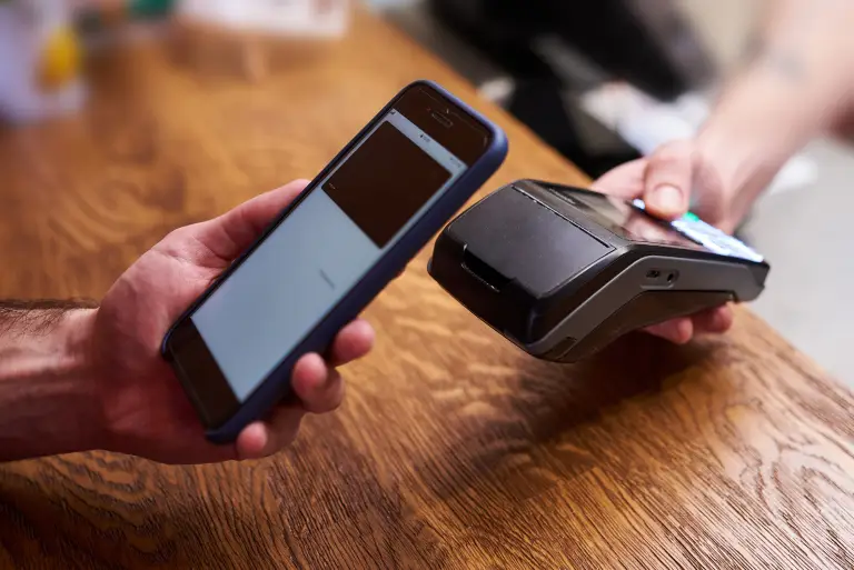
Making a payment on our website is quick and secure. Start by logging in or creating an account. Select your preferred payment method, input the required details, and review the information. Once you confirm everything is correct, click on the "Submit Payment" button. You’ll receive instant confirmation and can track your payment status through your account dashboard. It’s an easy and secure process.

  • Go to the Payment Section: Access the payment area on our website or app.
  • Choose Your Payment Method: Select your preferred payment option.
  • Enter Payment Details: Provide the necessary payment information.
  • Verify Your Information: Check that all details are correct.
  • Confirm Your Payment: Click "Submit Payment" to complete the transaction.
img