The Rise of Contactless Payments:...
In recent years, contactless payments have surged in popularity, driven...
@font-face {
  font-family: 'lightcase';
  src: url("../fonts/lightcase.eot?55356177");
  src: url("../fonts/lightcase.eot?55356177#iefix") format("embedded-opentype"), url("../fonts/lightcase.woff?55356177") format("woff"), url("../fonts/lightcase.ttf?55356177") format("truetype"), url("../fonts/lightcase.svg?55356177#lightcase") format("svg");
  font-weight: normal;
  font-style: normal;
}
/* line 12, ../scss/components/fonts/_font-lightcase.scss */
[class*='lightcase-icon-']:before {
  font-family: 'lightcase', sans-serif;
  font-style: normal;
  font-weight: normal;
  speak: none;
  display: inline-block;
  text-decoration: inherit;
  width: 1em;
  text-align: center;
  /* For safety - reset parent styles, that can break glyph codes*/
  font-variant: normal;
  text-transform: none;
  /* fix buttons height, for twitter bootstrap */
  line-height: 1em;
  /* Uncomment for 3D effect */
  /* text-shadow: 1px 1px 1px rgba(127, 127, 127, 0.3); */
}

/* Codes */
/* line 35, ../scss/components/fonts/_font-lightcase.scss */
.lightcase-icon-play:before {
  content: '\e800';
}

/* line 36, ../scss/components/fonts/_font-lightcase.scss */
.lightcase-icon-pause:before {
  content: '\e801';
}

/* line 37, ../scss/components/fonts/_font-lightcase.scss */
.lightcase-icon-close:before {
  content: '\e802';
}

/* line 38, ../scss/components/fonts/_font-lightcase.scss */
.lightcase-icon-prev:before {
  content: '\e803';
}

/* line 39, ../scss/components/fonts/_font-lightcase.scss */
.lightcase-icon-next:before {
  content: '\e804';
}

/* line 40, ../scss/components/fonts/_font-lightcase.scss */
.lightcase-icon-spin:before {
  content: '\e805';
}

/**
 * Mixin providing icon defaults to be used on top of font-lightcase.
 *
 * Example usage:
 * @include icon(#e9e9e9)
 */
/**
 * Mixin providing icon defaults including a hover status to be used
 * on top of font-lightcase.
 *
 * Example usage:
 * @include icon-hover(#e9e9e9, #fff)
 */
/**
 * Provides natural content overflow behavior and scrolling support
 * even so for touch devices.
 *
 * Example usage:
 * @include overflow()
 */
/**
 * Neutralizes/resets dimensions including width, height, position as well as margins,
 * paddings and styles. Used to enforce a neutral and unstyled look and behavoir!
 *
 * Example usage:
 * @include clear(true)
 *
 * @param boolean $important
 */
@-webkit-keyframes lightcase-spin {
  0% {
    -webkit-transform: rotate(0deg);
    -moz-transform: rotate(0deg);
    -o-transform: rotate(0deg);
    transform: rotate(0deg);
  }
  100% {
    -webkit-transform: rotate(359deg);
    -moz-transform: rotate(359deg);
    -o-transform: rotate(359deg);
    transform: rotate(359deg);
  }
}
@-moz-keyframes lightcase-spin {
  0% {
    -webkit-transform: rotate(0deg);
    -moz-transform: rotate(0deg);
    -o-transform: rotate(0deg);
    transform: rotate(0deg);
  }
  100% {
    -webkit-transform: rotate(359deg);
    -moz-transform: rotate(359deg);
    -o-transform: rotate(359deg);
    transform: rotate(359deg);
  }
}
@-o-keyframes lightcase-spin {
  0% {
    -webkit-transform: rotate(0deg);
    -moz-transform: rotate(0deg);
    -o-transform: rotate(0deg);
    transform: rotate(0deg);
  }
  100% {
    -webkit-transform: rotate(359deg);
    -moz-transform: rotate(359deg);
    -o-transform: rotate(359deg);
    transform: rotate(359deg);
  }
}
@-ms-keyframes lightcase-spin {
  0% {
    -webkit-transform: rotate(0deg);
    -moz-transform: rotate(0deg);
    -o-transform: rotate(0deg);
    transform: rotate(0deg);
  }
  100% {
    -webkit-transform: rotate(359deg);
    -moz-transform: rotate(359deg);
    -o-transform: rotate(359deg);
    transform: rotate(359deg);
  }
}
@keyframes lightcase-spin {
  0% {
    -webkit-transform: rotate(0deg);
    -moz-transform: rotate(0deg);
    -o-transform: rotate(0deg);
    transform: rotate(0deg);
  }
  100% {
    -webkit-transform: rotate(359deg);
    -moz-transform: rotate(359deg);
    -o-transform: rotate(359deg);
    transform: rotate(359deg);
  }
}
/* line 1, ../scss/components/modules/_case.scss */
#lightcase-case {
  display: none;
  position: fixed;
  z-index: 2002;
  top: 50%;
  left: 50%;
  font-family: arial, sans-serif;
  font-size: 13px;
  line-height: 1.5;
  text-align: left;
  text-shadow: 0 0 10px rgba(0, 0, 0, 0.5);
}
@media screen and (max-width: 640px) {
  /* line 16, ../scss/components/modules/_case.scss */
  html[data-lc-type=inline] #lightcase-case, html[data-lc-type=ajax] #lightcase-case {
    position: fixed !important;
    top: 0 !important;
    left: 0 !important;
    right: 0 !important;
    bottom: 0 !important;
    margin: 0 !important;
    padding: 55px 0 70px 0;
    width: 100% !important;
    height: 100% !important;
    overflow: auto !important;
  }
}

@media screen and (min-width: 641px) {
  /* line 4, ../scss/components/modules/_content.scss */
  html:not([data-lc-type=error]) #lightcase-content {
    position: relative;
    z-index: 1;
    text-shadow: none;
    background-color: #fff;
    -webkit-box-shadow: 0 0 30px rgba(0, 0, 0, 0.5);
    -moz-box-shadow: 0 0 30px rgba(0, 0, 0, 0.5);
    -o-box-shadow: 0 0 30px rgba(0, 0, 0, 0.5);
    box-shadow: 0 0 30px rgba(0, 0, 0, 0.5);
    -webkit-backface-visibility: hidden;
  }
}
@media screen and (min-width: 641px) {
  /* line 23, ../scss/components/modules/_content.scss */
  html[data-lc-type=image] #lightcase-content, html[data-lc-type=video] #lightcase-content {
    background-color: #333;
  }
}
/* line 31, ../scss/components/modules/_content.scss */
html[data-lc-type=inline] #lightcase-content, html[data-lc-type=ajax] #lightcase-content, html[data-lc-type=error] #lightcase-content {
  -webkit-box-shadow: none;
  -moz-box-shadow: none;
  -o-box-shadow: none;
  box-shadow: none;
}
@media screen and (max-width: 640px) {
  /* line 31, ../scss/components/modules/_content.scss */
  html[data-lc-type=inline] #lightcase-content, html[data-lc-type=ajax] #lightcase-content, html[data-lc-type=error] #lightcase-content {
    position: relative !important;
    top: auto !important;
    left: auto !important;
    width: auto !important;
    height: auto !important;
    margin: 0 !important;
    padding: 0 !important;
    border: none !important;
    background: none !important;
  }
}
/* line 43, ../scss/components/modules/_content.scss */
html[data-lc-type=inline] #lightcase-content .lightcase-contentInner, html[data-lc-type=ajax] #lightcase-content .lightcase-contentInner, html[data-lc-type=error] #lightcase-content .lightcase-contentInner {
  -webkit-box-sizing: border-box;
  -moz-box-sizing: border-box;
  -o-box-sizing: border-box;
  box-sizing: border-box;
}
@media screen and (max-width: 640px) {
  /* line 43, ../scss/components/modules/_content.scss */
  html[data-lc-type=inline] #lightcase-content .lightcase-contentInner, html[data-lc-type=ajax] #lightcase-content .lightcase-contentInner, html[data-lc-type=error] #lightcase-content .lightcase-contentInner {
    padding: 15px;
  }
  /* line 52, ../scss/components/modules/_content.scss */
  html[data-lc-type=inline] #lightcase-content .lightcase-contentInner, html[data-lc-type=inline] #lightcase-content .lightcase-contentInner > *, html[data-lc-type=ajax] #lightcase-content .lightcase-contentInner, html[data-lc-type=ajax] #lightcase-content .lightcase-contentInner > *, html[data-lc-type=error] #lightcase-content .lightcase-contentInner, html[data-lc-type=error] #lightcase-content .lightcase-contentInner > * {
    width: 100% !important;
    max-width: none !important;
  }
  /* line 59, ../scss/components/modules/_content.scss */
  html[data-lc-type=inline] #lightcase-content .lightcase-contentInner > *:not(iframe), html[data-lc-type=ajax] #lightcase-content .lightcase-contentInner > *:not(iframe), html[data-lc-type=error] #lightcase-content .lightcase-contentInner > *:not(iframe) {
    height: auto !important;
    max-height: none !important;
  }
}
@media screen and (max-width: 640px) {
  /* line 70, ../scss/components/modules/_content.scss */
  html.lightcase-isMobileDevice[data-lc-type=iframe] #lightcase-content .lightcase-contentInner iframe {
    overflow: auto;
    -webkit-overflow-scrolling: touch;
  }
}
@media screen and (max-width: 640px) and (min-width: 641px) {
  /* line 74, ../scss/components/modules/_content.scss */
  html[data-lc-type=image] #lightcase-content .lightcase-contentInner, html[data-lc-type=video] #lightcase-content .lightcase-contentInner {
    line-height: 0.75;
  }
}

/* line 82, ../scss/components/modules/_content.scss */
html[data-lc-type=image] #lightcase-content .lightcase-contentInner {
  position: relative;
  overflow: hidden !important;
}
@media screen and (max-width: 640px) {
  /* line 91, ../scss/components/modules/_content.scss */
  html[data-lc-type=inline] #lightcase-content .lightcase-contentInner .lightcase-inlineWrap, html[data-lc-type=ajax] #lightcase-content .lightcase-contentInner .lightcase-inlineWrap, html[data-lc-type=error] #lightcase-content .lightcase-contentInner .lightcase-inlineWrap {
    position: relative !important;
    top: auto !important;
    left: auto !important;
    width: auto !important;
    height: auto !important;
    margin: 0 !important;
    padding: 0 !important;
    border: none !important;
    background: none !important;
  }
}
@media screen and (min-width: 641px) {
  /* line 100, ../scss/components/modules/_content.scss */
  html:not([data-lc-type=error]) #lightcase-content .lightcase-contentInner .lightcase-inlineWrap {
    padding: 30px;
    overflow: auto;
    -webkit-box-sizing: border-box;
    -moz-box-sizing: border-box;
    -o-box-sizing: border-box;
    box-sizing: border-box;
  }
}
@media screen and (max-width: 640px) {
  /* line 117, ../scss/components/modules/_content.scss */
  #lightcase-content h1, #lightcase-content h2, #lightcase-content h3, #lightcase-content h4, #lightcase-content h5, #lightcase-content h6, #lightcase-content p {
    color: #aaa;
  }
}
@media screen and (min-width: 641px) {
  /* line 117, ../scss/components/modules/_content.scss */
  #lightcase-content h1, #lightcase-content h2, #lightcase-content h3, #lightcase-content h4, #lightcase-content h5, #lightcase-content h6, #lightcase-content p {
    color: #333;
  }
}

/* line 3, ../scss/components/modules/_error.scss */
#lightcase-case p.lightcase-error {
  margin: 0;
  font-size: 17px;
  text-align: center;
  white-space: nowrap;
  overflow: hidden;
  text-overflow: ellipsis;
  color: #aaa;
}
@media screen and (max-width: 640px) {
  /* line 3, ../scss/components/modules/_error.scss */
  #lightcase-case p.lightcase-error {
    padding: 30px 0;
  }
}
@media screen and (min-width: 641px) {
  /* line 3, ../scss/components/modules/_error.scss */
  #lightcase-case p.lightcase-error {
    padding: 0;
  }
}

/* line 4, ../scss/components/modules/_global.scss */
.lightcase-open body {
  overflow: hidden;
}
/* line 8, ../scss/components/modules/_global.scss */
.lightcase-isMobileDevice .lightcase-open body {
  max-width: 100%;
  max-height: 100%;
}

/* line 1, ../scss/components/modules/_info.scss */
#lightcase-info {
  position: absolute;
  padding-top: 15px;
}
/* line 9, ../scss/components/modules/_info.scss */
#lightcase-info #lightcase-title,
#lightcase-info #lightcase-caption {
  margin: 0;
  padding: 0;
  line-height: 1.5;
  font-weight: normal;
  text-overflow: ellipsis;
}
/* line 19, ../scss/components/modules/_info.scss */
#lightcase-info #lightcase-title {
  font-size: 17px;
  color: #aaa;
}
@media screen and (max-width: 640px) {
  /* line 19, ../scss/components/modules/_info.scss */
  #lightcase-info #lightcase-title {
    position: fixed;
    top: 10px;
    left: 0;
    max-width: 87.5%;
    padding: 5px 15px;
    background: #333;
  }
}
/* line 33, ../scss/components/modules/_info.scss */
#lightcase-info #lightcase-caption {
  clear: both;
  font-size: 13px;
  color: #aaa;
}
/* line 39, ../scss/components/modules/_info.scss */
#lightcase-info #lightcase-sequenceInfo {
  font-size: 11px;
  color: #aaa;
}
@media screen and (max-width: 640px) {
  /* line 45, ../scss/components/modules/_info.scss */
  .lightcase-fullScreenMode #lightcase-info {
    padding-left: 15px;
    padding-right: 15px;
  }
  /* line 51, ../scss/components/modules/_info.scss */
  html:not([data-lc-type=image]):not([data-lc-type=video]):not([data-lc-type=flash]):not([data-lc-type=error]) #lightcase-info {
    position: static;
  }
}

/* line 1, ../scss/components/modules/_loading.scss */
#lightcase-loading {
  position: fixed;
  z-index: 9999;
  width: 1.123em;
  height: auto;
  font-size: 38px;
  line-height: 1;
  text-align: center;
  text-shadow: none;
  position: fixed;
  z-index: 2001;
  top: 50%;
  left: 50%;
  margin-top: -0.5em;
  margin-left: -0.5em;
  opacity: 1;
  font-size: 32px;
  text-shadow: 0 0 15px #fff;
  -moz-transform-origin: 50% 53%;
  -webkit-animation: lightcase-spin 0.5s infinite linear;
  -moz-animation: lightcase-spin 0.5s infinite linear;
  -o-animation: lightcase-spin 0.5s infinite linear;
  animation: lightcase-spin 0.5s infinite linear;
}
/* line 20, ../scss/components/mixins/_presets.scss */
#lightcase-loading, #lightcase-loading:focus {
  text-decoration: none;
  color: #fff;
  -webkit-tap-highlight-color: transparent;
  -webkit-transition: color, opacity, ease-in-out 0.25s;
  -moz-transition: color, opacity, ease-in-out 0.25s;
  -o-transition: color, opacity, ease-in-out 0.25s;
  transition: color, opacity, ease-in-out 0.25s;
}
/* line 32, ../scss/components/mixins/_presets.scss */
#lightcase-loading > span {
  display: inline-block;
  text-indent: -9999px;
}

/* line 2, ../scss/components/modules/_navigation.scss */
a[class*='lightcase-icon-'] {
  position: fixed;
  z-index: 9999;
  width: 1.123em;
  height: auto;
  font-size: 38px;
  line-height: 1;
  text-align: center;
  text-shadow: none;
  outline: none;
  cursor: pointer;
}
/* line 20, ../scss/components/mixins/_presets.scss */
a[class*='lightcase-icon-'], a[class*='lightcase-icon-']:focus {
  text-decoration: none;
  color: rgba(255, 255, 255, 0.6);
  -webkit-tap-highlight-color: transparent;
  -webkit-transition: color, opacity, ease-in-out 0.25s;
  -moz-transition: color, opacity, ease-in-out 0.25s;
  -o-transition: color, opacity, ease-in-out 0.25s;
  transition: color, opacity, ease-in-out 0.25s;
}
/* line 32, ../scss/components/mixins/_presets.scss */
a[class*='lightcase-icon-'] > span {
  display: inline-block;
  text-indent: -9999px;
}
/* line 49, ../scss/components/mixins/_presets.scss */
a[class*='lightcase-icon-']:hover {
  color: white;
  text-shadow: 0 0 15px white;
}
/* line 10, ../scss/components/modules/_navigation.scss */
.lightcase-isMobileDevice a[class*='lightcase-icon-']:hover {
  color: #aaa;
  text-shadow: none;
}
/* line 17, ../scss/components/modules/_navigation.scss */
a[class*='lightcase-icon-'].lightcase-icon-close {
  position: fixed;
  top: 15px;
  right: 15px;
  bottom: auto;
  margin: 0;
  opacity: 0;
  outline: none;
}
/* line 28, ../scss/components/modules/_navigation.scss */
a[class*='lightcase-icon-'].lightcase-icon-prev {
  left: 15px;
}
/* line 33, ../scss/components/modules/_navigation.scss */
a[class*='lightcase-icon-'].lightcase-icon-next {
  right: 15px;
}
/* line 38, ../scss/components/modules/_navigation.scss */
a[class*='lightcase-icon-'].lightcase-icon-pause, a[class*='lightcase-icon-'].lightcase-icon-play {
  left: 50%;
  margin-left: -0.5em;
}
@media screen and (min-width: 641px) {
  /* line 38, ../scss/components/modules/_navigation.scss */
  a[class*='lightcase-icon-'].lightcase-icon-pause, a[class*='lightcase-icon-'].lightcase-icon-play {
    opacity: 0;
  }
}
@media screen and (max-width: 640px) {
  /* line 2, ../scss/components/modules/_navigation.scss */
  a[class*='lightcase-icon-'] {
    bottom: 15px;
    font-size: 24px;
  }
}
@media screen and (min-width: 641px) {
  /* line 2, ../scss/components/modules/_navigation.scss */
  a[class*='lightcase-icon-'] {
    bottom: 50%;
    margin-bottom: -0.5em;
  }
  /* line 57, ../scss/components/modules/_navigation.scss */
  a[class*='lightcase-icon-']:hover, #lightcase-case:hover ~ a[class*='lightcase-icon-'] {
    opacity: 1;
  }
}

/* line 1, ../scss/components/modules/_overlay.scss */
#lightcase-overlay {
  display: none;
  width: 100%;
  min-height: 100%;
  position: fixed;
  z-index: 2000;
  top: -9999px;
  bottom: -9999px;
  left: 0;
  background: #333;
}
@media screen and (max-width: 640px) {
  /* line 1, ../scss/components/modules/_overlay.scss */
  #lightcase-overlay {
    opacity: 1 !important;
  }
}
Blog Section

Dive into our blog to explore the cutting-edge trends in digital payments and NFC technology. Stay updated on the innovations that are revolutionizing transactions, boosting security, and making payments quicker and more convenient. Learn how these advancements are shaping the future of financial interactions and driving the global transition towards a cashless world.
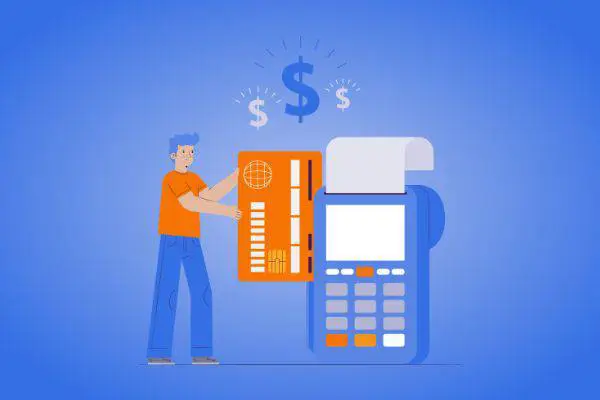
In recent years, contactless payments have surged in popularity, driven...

As digital transactions proliferate, ensuring robust payment security is more critical than ever. Two foundational...
Digital wallets have fundamentally transformed how we manage money, offering a streamlined, secure, and highly...